Making an exhibit dedicated to a writer legible
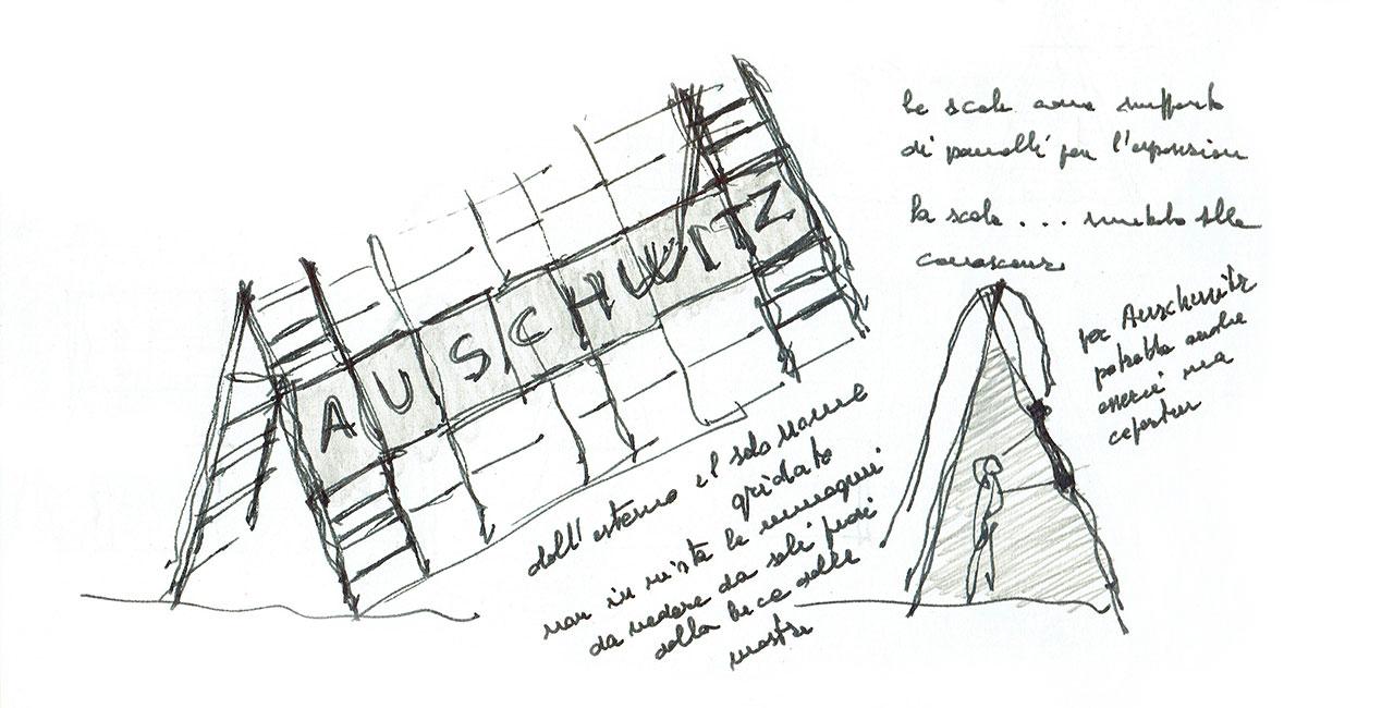
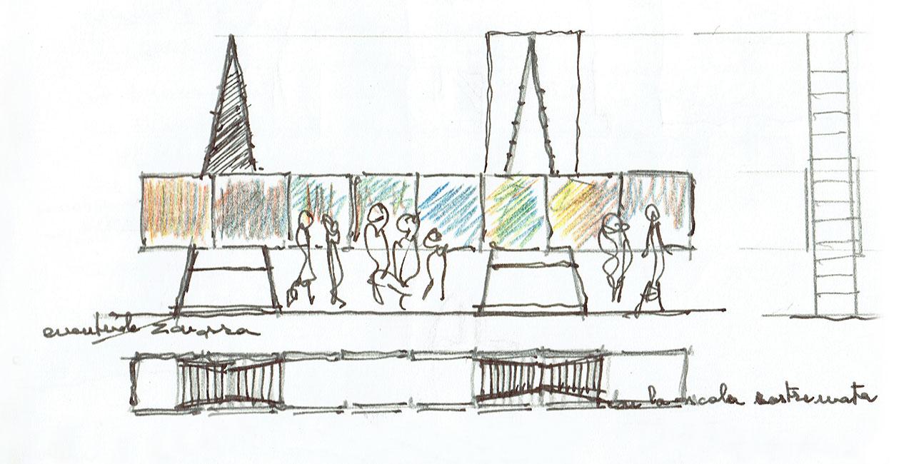
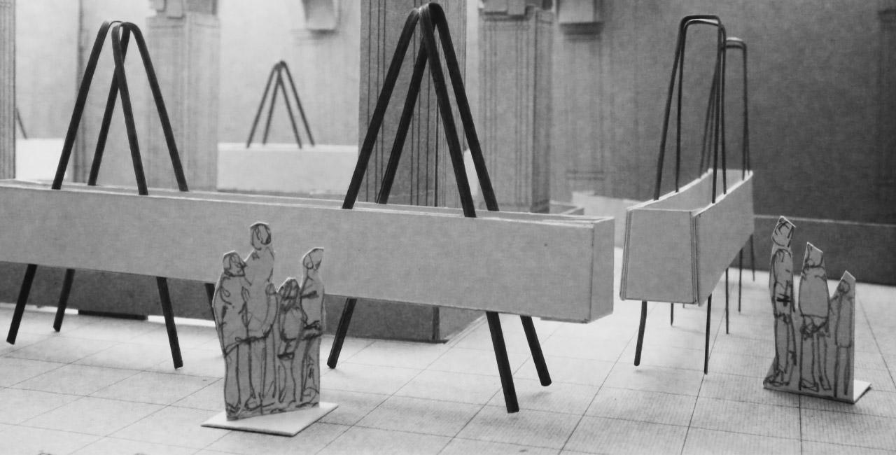
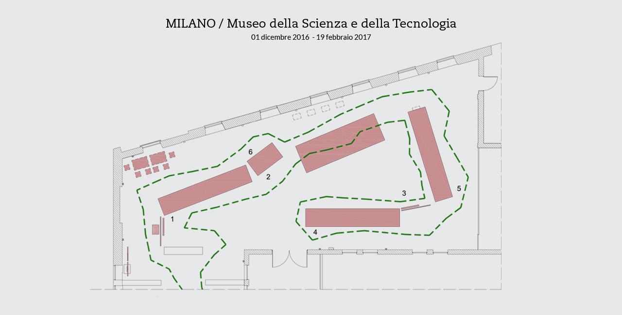
The project of the design took shape together with the project for the exhibit, which was conceived of as a travelling exhibit from its beginning. Because it was an exhibit dedicated to a writer, it was inspired by the equipment of reading and writing, more particularly by the reading stands at the Biblioteca Laurenziana in Florence, by workstations, areas marked off within a large space. The overall structure has limited its weight and volume to make it easier to transport. Thus it consists in a sequence of panels inclined like lecterns positioned on supports that can be assembled and disassembled according to the direction of the path that the visitors are guided on from the entrance to the exit.
The organization of the spaces
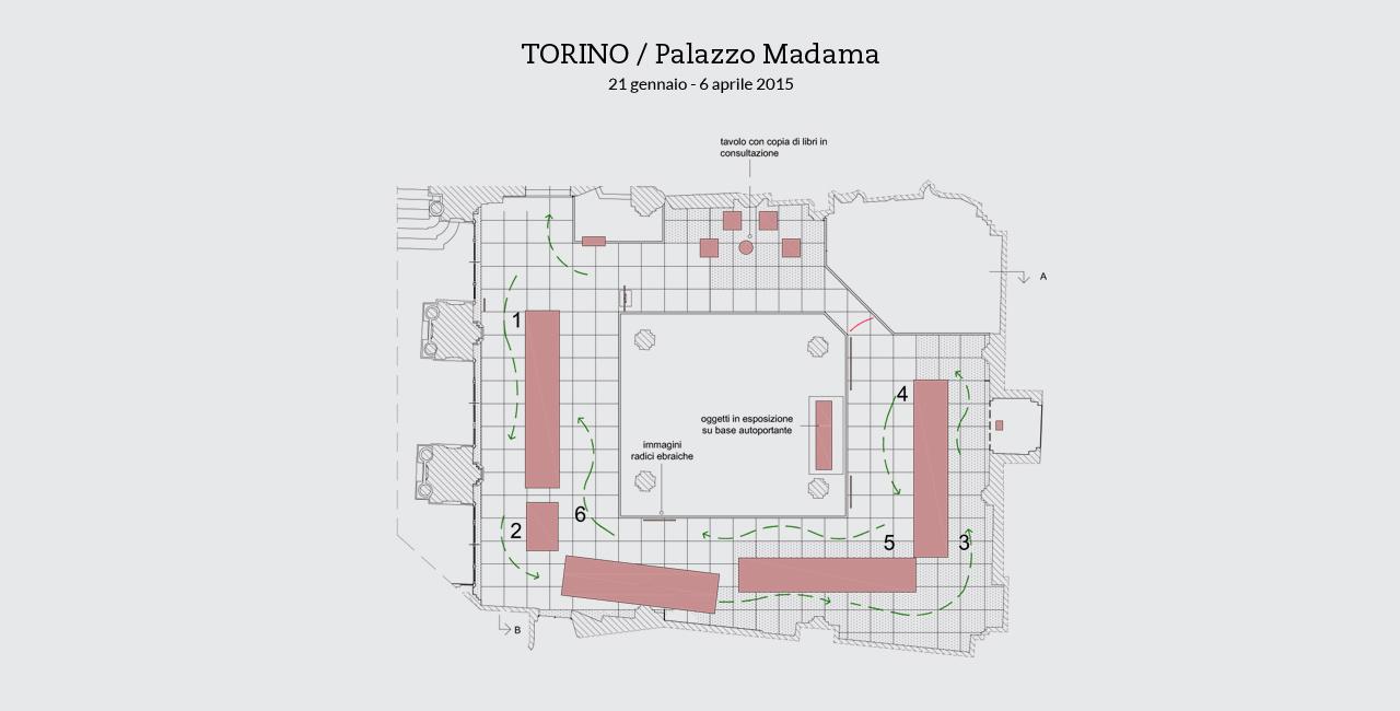
Along the direction of the visit, the design calls for a specific space dedicated to Auschwitz, conceived of purposely to facilitate each visitor’s personal approach to it: visitors find themselves alone and face to face with the words of Levi. There should be a space for group discussions and another space where visitors can consult the works of Levi on their own.

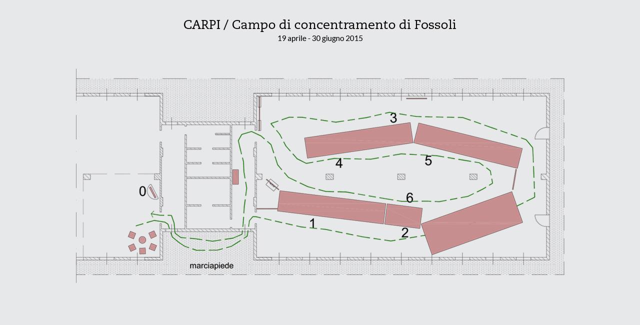
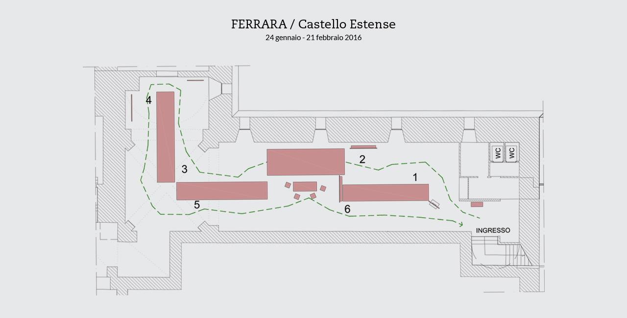
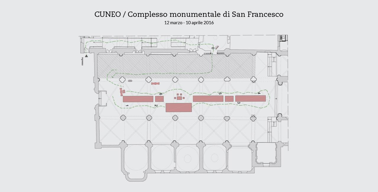
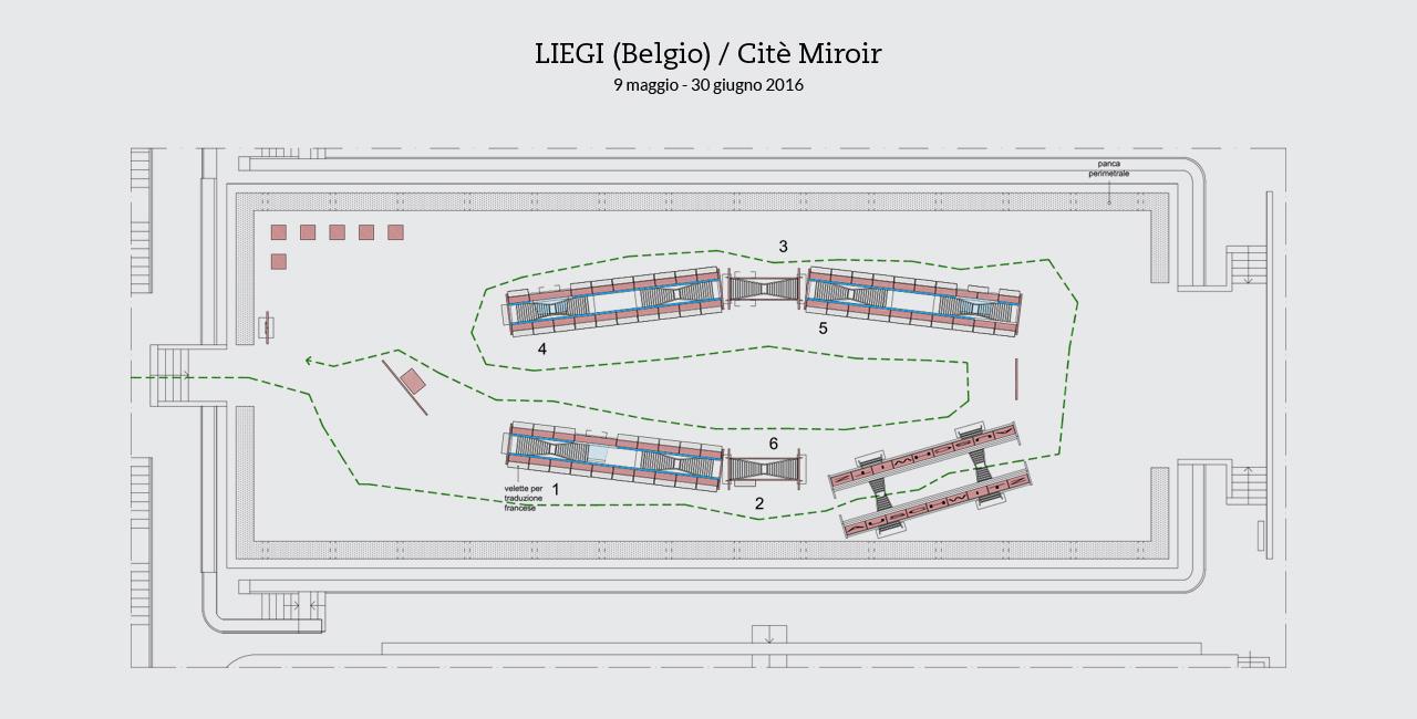
The features of the materials as perceived by the visitors
The design presents itself as a kind of expressive erector set integrated with foldable supports, made up of industrially produced aluminum double ladders. Aside from bases and some panels in metal, the design is realized in beams and sheets, aluminum as well. The materials are only partially processed, exposing their natural states and thus enabling visitors to perceive their transformation into what they are used for. These materials provide the exhibit with the presence of matter in its concreteness and in its continual mutation. This is meant as a direct reference to The Periodic Table, the extraordinary book of Levi’s that makes tangible the deep bond between matter and human beings.
Flexibility as challenge and meaning
The clarity and versatility of Primo Levi’s writings are qualities that are taken up and interpreted by the design, in its essentialness and in its flexibility as to how to distribute the various sections of the exhibit. All of this made the overall structure fully compatible, from the moment that the design was first conceived, with destinations and spaces that cannot be foreseen. Every new edition becomes a kind of challenge for the project, aiming to adapt the exhibit to the particular spaces that are available.
An exhibit with two possible designs
Two different designs are available without subjecting the contents of the exhibit to any variations:
•the first, conceived for large spaces (c.300m²), is autonomous, self-supporting and fully equipped with its own lighting;
•the second, called the “light-weight exhibit,” is meant for exhibit sites organized in halls whose walls can support hanging panels and videos and whose lighting systems are ready for use.

